Experiments in Visualizing Machine Learning Architecture

The original paper’s arcitecture diagram for comparison. I think this diagram has less info and is harder to parse (particularly to double arrows going to the attention weights and code vector, when it’s actually easily expressed in a step-by-step way that’s easier to visually understand.

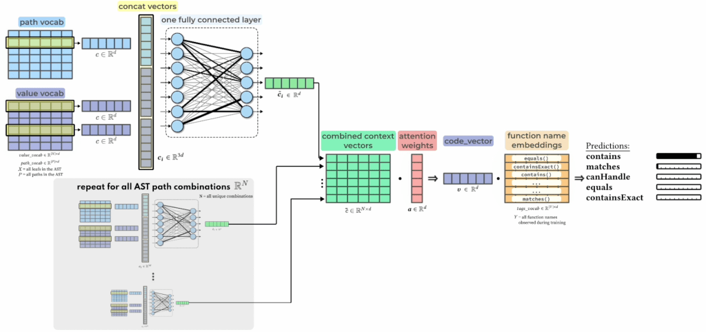
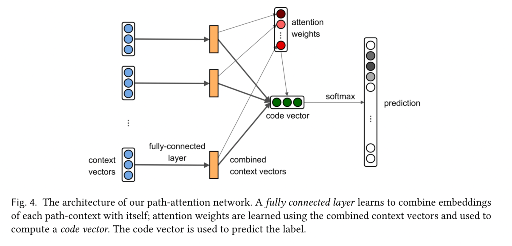
To best present this material, I broke the network down in order to introduce one step at a time.

Similarly, this version glows to highlight which parameters are learnable.

I designed this in Figma, using a few plugins for the grid, arrows, and glowing effects.

Here’s a rough draft I made in the CleanShot editor tool.

This makes learning the structure more intuitive for beginners, and faster for experienced researchers. Win-win.

I received great feedback on this design in a graduate class at UIUC, and I hope to continue innovating on better ways to communicate technical information.

Unusually active Zoom chat.

Leave a Reply

Fill in your details below or click an icon to log in:

WordPress.com Logo

You are commenting using your WordPress.com account. Log Out /  Change )

Facebook photo

You are commenting using your Facebook account. Log Out /  Change )

Connecting to %s

%d bloggers like this:
search previous next tag category expand menu location phone mail time cart zoom edit close