Detailed analysis of Code-2-vec, the original vector embeddings of code Circa 2018. Presented in Feb 2022.
I’m a visual learner, and I wish machine learning researchers put effort into showing off their work.
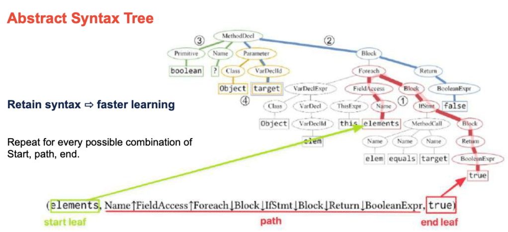
Each “path” through the code tree is then encoded as a vector embedding.
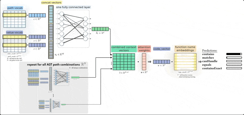
Putting it all together, here’s my favorite image of the complete Code-2-vec algorithm:
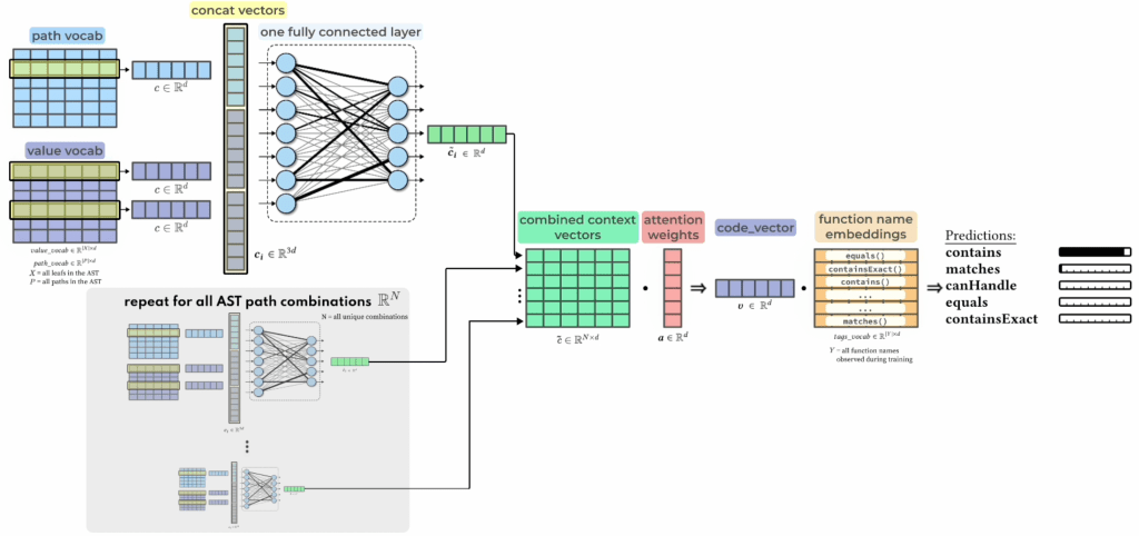
Here’s the original (top) and mine (bottom). I aim to communicate the specific mathematics in a visual interpretation of linear algebra.
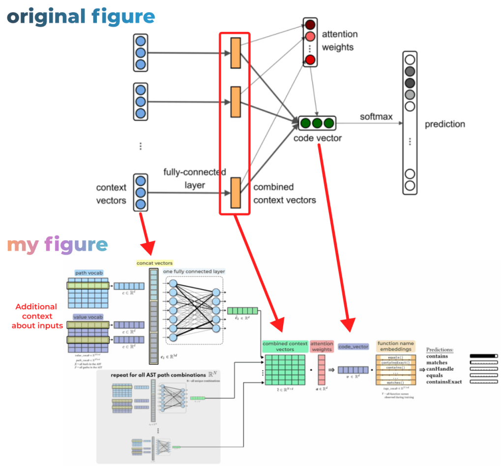
The original paper’s architecture diagram for comparison. I think this diagram has less info and is harder to parse (particularly to double arrows going to the attention weights and code vector, when it’s actually easily expressed in a step-by-step way that’s easier to visually understand.
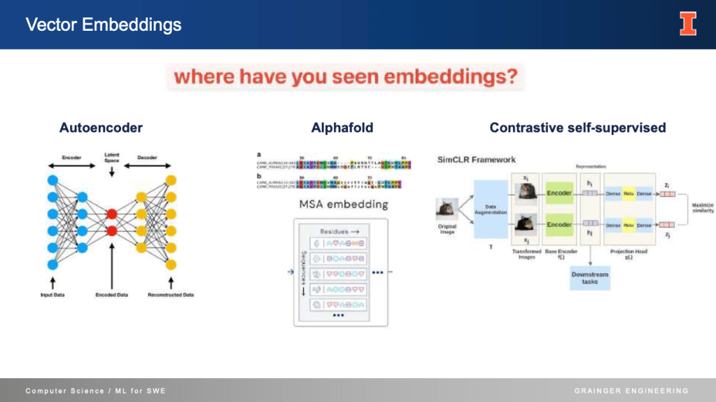
Diverse uses of Embeddings, they’re useful in so many practical applications